BuyerQuest
BuyerQuest is a software company based in Cleveland, Ohio. Their focus is creating eProcurement system solutions for large companies such as Disney, McDonald's, Caterpillar and Kimberly-Clark.
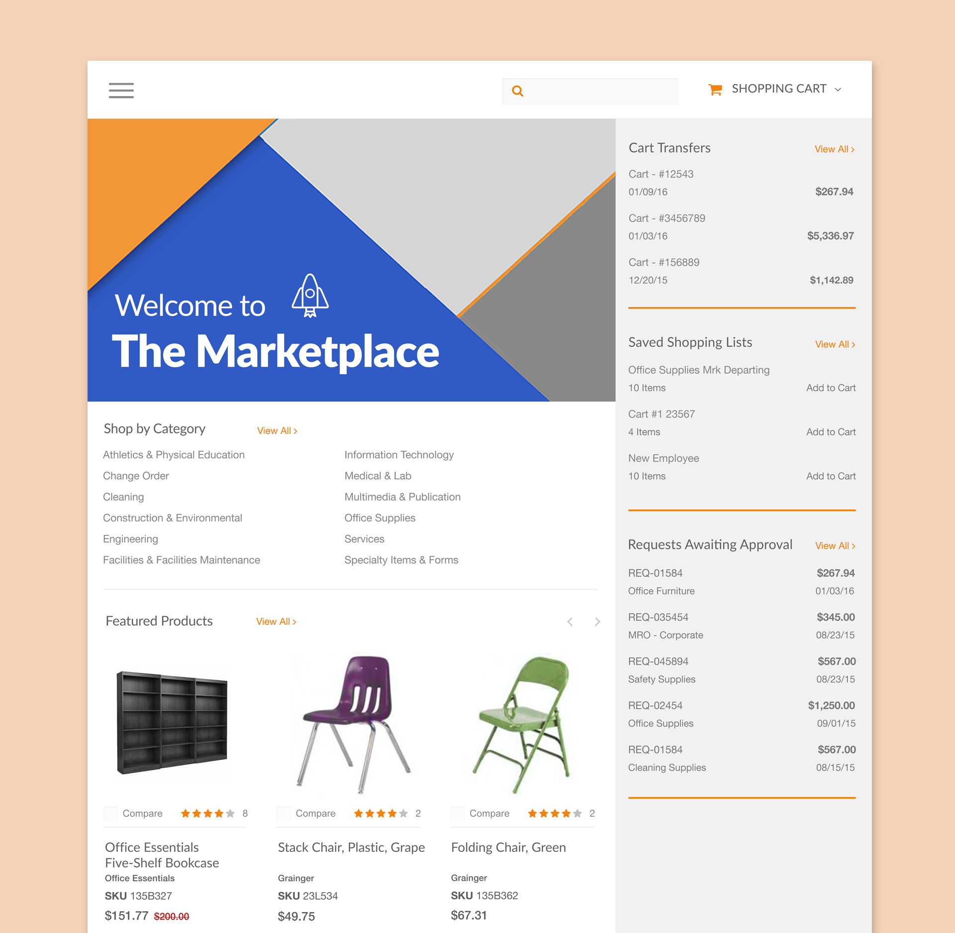
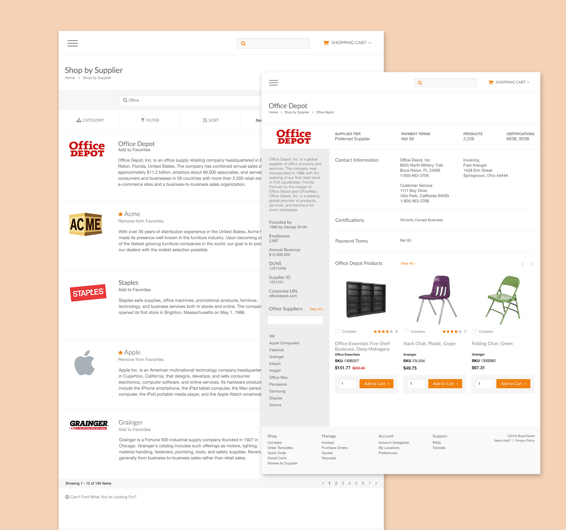
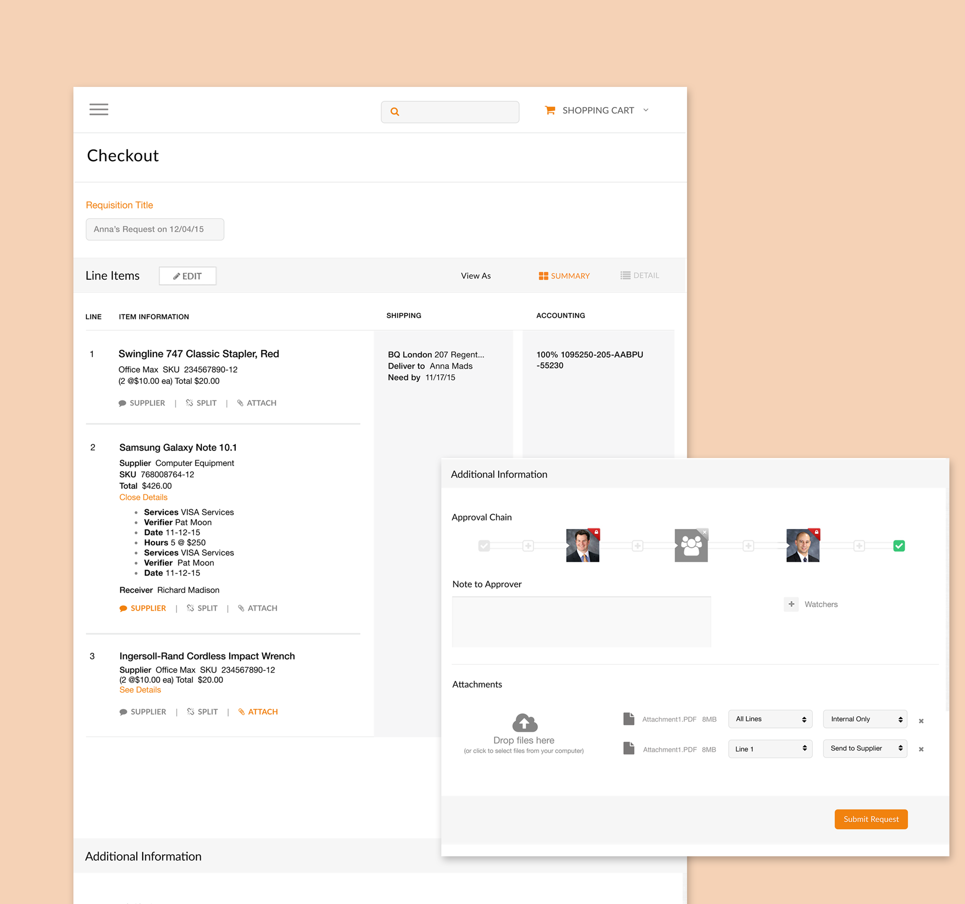
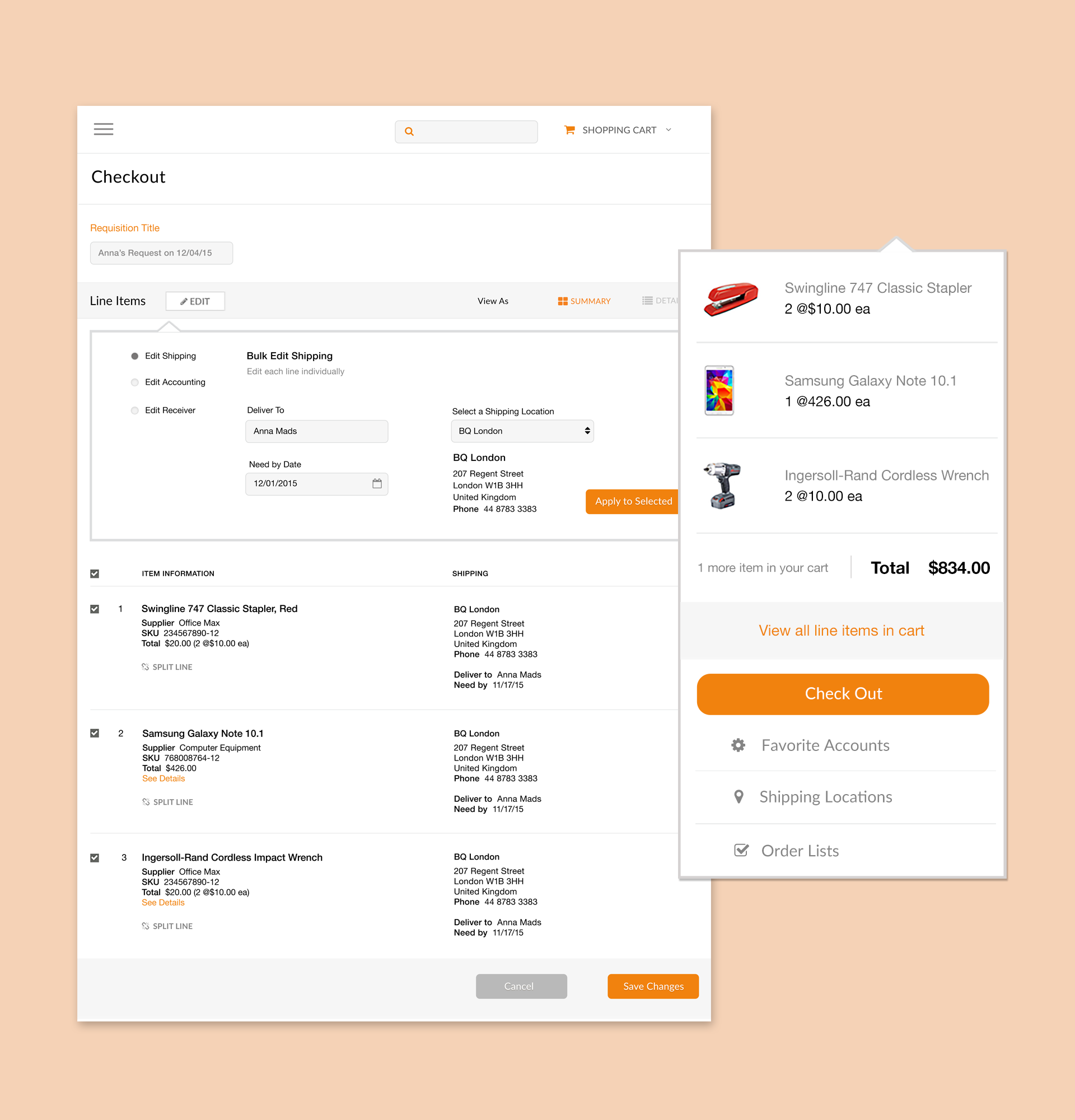
During my time at the company, I was responsible for designing a new checkout cart experience as well as their marketplace pages to make it easy for visitors to find the items they were looking for.
Creative Process
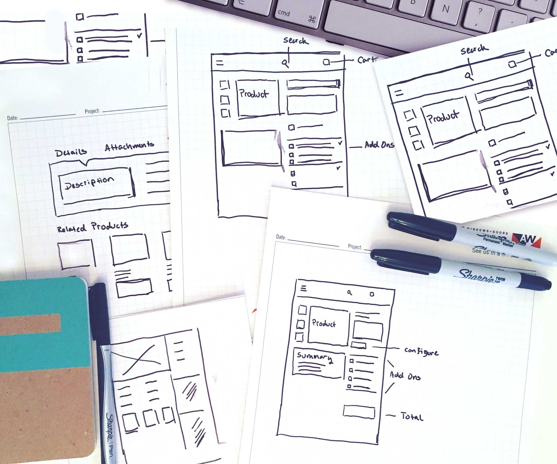
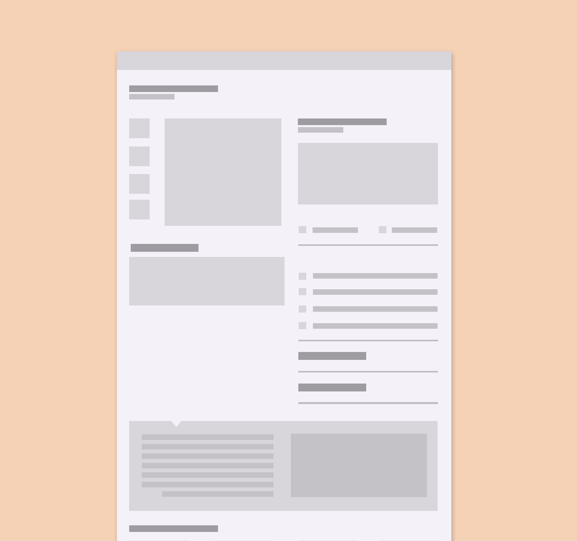
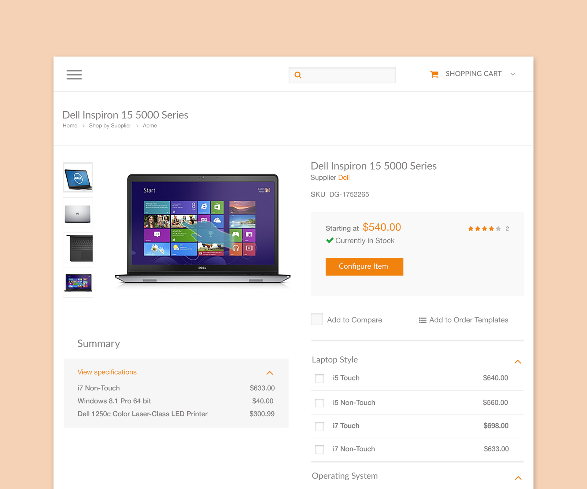
After I sketched out different ideas, I started to put together wireframes for each step of the checkout process. Once the wireframes were approved, I moved into creating prototypes with Sketch. During this project, I would collaborate and meet with the developers on a daily basis to make sure I was factoring in each scenario. When something was missed, we would work together on finding solutions. Once my designs were ready to hand off to the developers, I wrote out specs and notes for each component.
Because I documented the existing checkout cart flow, I discovered a few key features were missing from the experience. Some areas of the current cart didn't have error messages or options to move to the next screen. Whenever there was a gap discovered, I was able to pull in the developers and add items that were previously missed.
I worked off the wireframes and compiled prototypes for each page along with a series of actions. To make sure the project kicked off with ease, I collaborated with the developers to hand them my designs and go over each stage of the cart.
Results
Customers reacted positively to the new design and we received a lot of positive feedback.
“This (new) cart reigns supreme without a doubt. The entire shopping experience was much easier than before”
“The new update feels much more direct and clear. We weren’t overwhelmed with a huge navigation menu at the top.”
Key Takeaways
Documenting the current state and use cases was time consuming, but it helped me understand the customer journey. I learned that there were many edge cases that could potentially prevent the customer from checking out. Continuous reviews with the developers, engineers and product partners ensured the new checkout process would be much more seamless.
